The Message card is the DM itself. The dropdown in its header decides what shape that DM takes — and the shape matters more than most people expect, because a tappable button gets clicked far more often than a link pasted into a sentence.
Plain text
Just words. Up to 1,000 characters, links included.
Instagram turns a pasted URL into a tappable link, so plain text is perfectly workable for a single link — it just looks like a normal message rather than a card. Use it for conversational openers, answers to questions, and anywhere a designed card would feel like an ad.
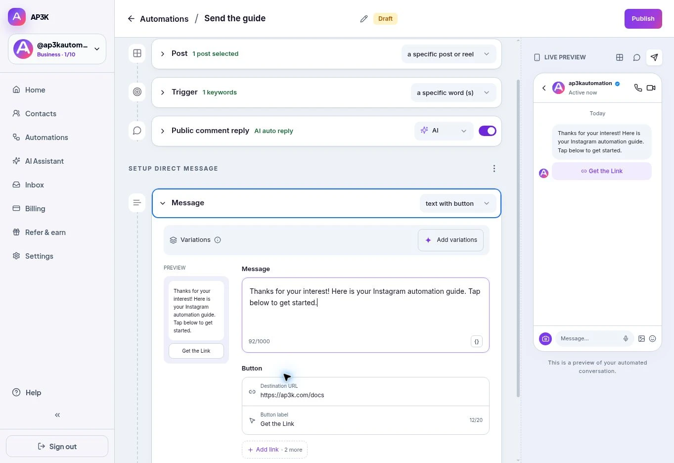
Text with button
The same message, with up to three buttons underneath it. Each button has a link and a label of up to 20 characters.
This is the workhorse for link campaigns. The message explains, the button gets tapped, and you get a click you can count. + Add link adds a second and third button — enough for “Shop now / See sizes / Talk to us” without turning the DM into a menu.
Keep the message concise so the action remains easy to find. The editor lets you write up to 1,000 characters; button labels are limited to 20 characters.
Image with button
A product card: image on top, title, optional subtitle, and up to three buttons underneath. The quick Post editor creates one card. For a swipeable carousel of up to ten cards, use Auto DM product link carousel in Templates or the Product carousel node in Flow builder.
See Media in DMs for upload formats and limits.
Attachment
Sends a file — image, video, GIF, audio or PDF — instead of a formatted message. Also in Media in DMs.
Choosing
| You want to… | Use |
|---|---|
| Answer a question, sound human | Plain text |
| Send one link and count the taps | Text with button |
| Show a product, or several | Image with button |
| Deliver a guide, price list or clip | Attachment |
Text messages can use variations. The quick editor’s attachment and product-card layouts do not rotate uploaded media.